Design X Institute | Design School in Singapore
7 UX Design Accessibility Best Practices
Imagine visiting a website or using an app, only to find it difficult to navigate or interact with because of poorly designed elements. Now imagine this being a daily reality. For millions of people with disabilities, this is a common experience. But it doesn’t have to be. Accessible UX design is about creating digital experiences that are usable by everyone, regardless of their abilities.
Inclusive design is not just about ticking boxes or meeting legal requirements—it’s about empowering all users and building products that cater to diverse needs. Let’s explore some key accessibility guidelines that will help you create a more inclusive user experience and make a positive impact.
1. Ensure Text is Readable and Understandable
Text readability is a fundamental aspect of accessibility. If users can’t read your content, they can’t engage with your product.
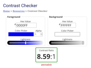
- Use High Contrast: People with visual impairments, such as low vision or colour blindness, rely on high contrast between text and background to read comfortably. Aim for a contrast ratio of at least 4.5:1 for normal text and 3:1 for larger text.
- Choose Legible Fonts: Fancy fonts might look stylish, but they can be hard to read. Opt for simple, sans-serif fonts like Arial or Roboto. Maintain a font size of at least 16px for body text to ensure readability.
- Avoid All Caps and Italics: Using all capital letters or italics can make text harder to read, especially for users with dyslexia. Instead, use clear headings, bullet points, and line spacing to break up content.
Pro Tip: Use online tools like WebAIM’s Contrast Checker to verify your text’s contrast ratio and ensure it meets accessibility standards.
2. Provide Text Alternatives for Visual Content
Images, videos, and other visual elements enrich digital experiences, but they can be challenging for users with visual impairments. To ensure everyone can access your content, provide text alternatives.
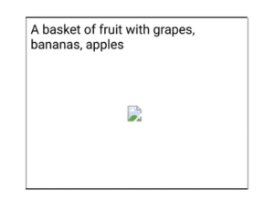
- Use Alt Text for Images: Add descriptive alternative text (alt text) to every image. This text is read aloud by screen readers, helping users understand what the image represents. For instance, instead of writing “Image of a woman,” use “Woman holding a smartphone and smiling.” When writing for alt text, keep it objective, and carefully describe what the image is trying to portray.
- Caption Videos: Include captions for all video content. Captions are not only helpful for users who are deaf or hard of hearing but also for anyone watching videos in a noisy environment.

- Describe Complex Images: For complex visuals like charts or infographics, provide detailed descriptions or data tables. This ensures users can access the information even if they can’t see the visual. According to W3.org, when complex images are being used “…a two-part text alternative is required. The first part is the short description to identify the image and, where appropriate, indicate the location of the long description. The second part is the long description – a textual representation of the essential information conveyed by the image. The following examples show different approaches that can be used to provide such short and long descriptions.”
Engaging Tip: Think of alt text as storytelling for those who can’t see the image. Make it informative, yet concise, painting a picture with your words.
3. Make Your Site Keyboard-Friendly
Many users with motor disabilities navigate websites using a keyboard rather than a mouse. Ensuring your product is fully keyboard-accessible is crucial for a seamless experience.
- Enable Tab Key Navigation: Users should be able to navigate through all interactive elements (e.g., links, buttons, forms) using the Tab key. Ensure the tab order follows a logical sequence.
- Provide Visible Focus Indicators: When users tab through a page, a visible outline (focus indicator) should highlight the current element. This helps users know where they are on the page. A common practice is using a visible border or underline.
- Avoid Keyboard Traps: Ensure users can navigate both forwards and backwards using the Tab and Shift + Tab keys. Avoid creating traps where a user can tab into an element but can’t tab out.
Try This: Unplug your mouse and navigate your site using only the keyboard. Can you access all content and features? If not, it’s time to make some adjustments.
4. Design with Colour in Mind
Colour is a powerful design tool, but relying solely on colour to convey information can exclude users who are colourblind or have low vision.
- Avoid Colour-Only Indicators: Don’t use colour as the only visual cue for important information. For example, instead of just using red to indicate errors in a form, include text (e.g., “Error: Please enter a valid email address”).
- Provide Sufficient Contrast: Ensure that your colour palette has enough contrast between elements. This helps users distinguish different parts of your interface, like buttons, links, and backgrounds.
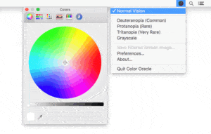
- Test for Colourblindness: Use tools like Color Oracle to simulate how your design looks to users with different types of colourblindness. This helps identify any colour-related accessibility issues.
5. Make Forms Accessible and User-Friendly
Forms are a critical part of many digital products, but they can be a significant barrier for users with disabilities. Accessible forms enhance usability for everyone.
- Label Form Fields Clearly: Every form field should have a visible label that describes what information is required. Avoid using placeholder text as the only label, as it disappears when users start typing.
- Provide Error Messages with Context: When users make a mistake, provide clear error messages that explain what went wrong and how to fix it. For example, instead of “Invalid input,” use “Please enter a valid email address in the format example@example.com.”
- Use Accessible Form Controls: Ensure that form controls (checkboxes, radio buttons, dropdowns) can be accessed and selected using a keyboard.
6. Offer Users Control Over Their Experience
Accessibility isn’t one-size-fits-all. Allowing users to adjust their experience can make your product more inclusive.
- Provide Adjustable Text Size: Enable users to increase or decrease text size without breaking the layout. Many browsers allow text resizing, so your design should accommodate this feature.
- Offer Dark Mode and High Contrast Options: Some users prefer dark mode or high contrast themes for better readability. Providing these options can enhance comfort and accessibility.
- Allow for Pausing Animations: Moving elements or auto-scrolling content can be distracting and even harmful to users with vestibular disorders. Provide a way to pause animations or disable them entirely.
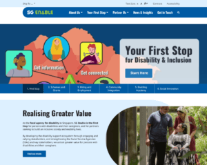
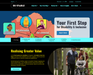
Check out SG Enable’s website to play around with their accessibility features

SG Enable’s Website features an Accessibility toolbar that helps users to change font sizes and toggle high contrast mode. This supports users who are colour blind, or have trouble reading the font sizes on the website.
7. Test with Real Users for Real Insights
The best way to ensure your product is accessible is by testing it with people who rely on these features.
- Conduct Accessibility Testing: Include users with disabilities in your usability testing sessions. Their feedback will provide invaluable insights into areas where your design can be improved.
- Use Assistive Technologies: Familiarise yourself with tools like screen readers (e.g., NVDA, VoiceOver), magnifiers, and speech recognition software. Test your product using these tools to identify potential issues.
- Iterate and Improve: Accessibility isn’t a one-time fix; it’s an ongoing process. Continuously gather feedback and refine your design to meet evolving user needs.
Engaging Insight: Seeing your product through the eyes of users with different abilities can be a game-changer. It opens up new perspectives and helps you create more empathetic, user-centred designs.
Text in images
An image like this might be eye-catching for fans of the brand Puma, but any form of text incorporated into an image cannot be picked up by screen reader technologies. Make sure that the alt text doesn’t only describe the images in the poster, but it also mentions the text in the poster.

Source: Puma
Navigating a website with the Tab Key
The TAB key allows a user to jump from one interactive element to another. Links, form fields, menus, and media player controls are all possible to navigate with the TAB key. If you want to activate a link or menu, use the ENTER key or space bar.
When movement is limited due to physical disabilities or injuries, the tab key should allow users to move across the website effectively. This process may be slow and somewhat tedious, but nevertheless, it should help users to get to where they want to go!
Unplug your mouse, and attempt to use the computer without the mouse. Are you able to effectively complete tasks that you are going to give to your users?
By embracing accessibility, you’re not just meeting compliance standards—you’re unlocking the full potential of your product for a broader audience. Accessibility makes your product easier to use for everyone, including those with temporary impairments (like a broken arm), situational limitations (like bright sunlight), and even those with slow internet connections.
Investing in accessible UX design leads to happier users, better engagement, and a more inclusive digital world. So, let’s commit to designing experiences that welcome everyone, because when we build with accessibility in mind, we create a better web for all.
For more practical and real world examples on UX accessibility and navigation best practices, check out our UX Design Courses.

Reader Interactions